As part of Ontario’s Open Data Initiative, the province releases a salary disclosure dataset every year covering all public sector employees who make over $100k. They have prominent links to a .csv download — I figure they want people to explore it. So I did.
raw <- read.csv(url("https://files.ontario.ca/pssd/en-2016-pssd-compendium-20170401-utf8.csv"))I put some repetitive chart customization into a theme function upfront:
theme_ <- function(...) {
  theme_bw() +
    theme(
      strip.background = element_blank(),
      strip.text = element_blank(),
      axis.ticks = element_blank(),
      axis.text.x = element_blank()
    )
}
The dataset needs a bit of cleaning: remove seconded employees, recode long sector strings, combine first and last names, isolate the English part of job titles, and parse salary fields as numbers:
salaries <- raw %>%
  filter(!grepl("Seconded", Sector)) %>%
  mutate(Sector = mapvalues(Sector,
    from = c("Government of Ontario - Legislative Assembly and Offices",
             "Government of Ontario - Judiciary",
             "Government of Ontario - Ministries",
             "Hospitals and Boards of Public Health"),
    to   = c("Legislative Assembly", "Judiciary",
             "Ministries", "Hospitals / Public Health Boards"))) %>%
  mutate(Full = paste(First.Name, Last.Name, " ")) %>%
  separate(Job.Title, c("Job.Title", "Other"), sep = "/") %>%
  mutate(Salary.Paid = as.numeric(sub("\\,", "", sub("\\$", "", Salary.Paid)))) %>%
  mutate(Taxable.Benefits = as.numeric(sub("\\,", "", sub("\\$", "", Taxable.Benefits)))) %>%
  select(-Calendar.Year, -Other)
We now have a clean dataset where every row is an Ontario public sector employee. Let’s take a look.
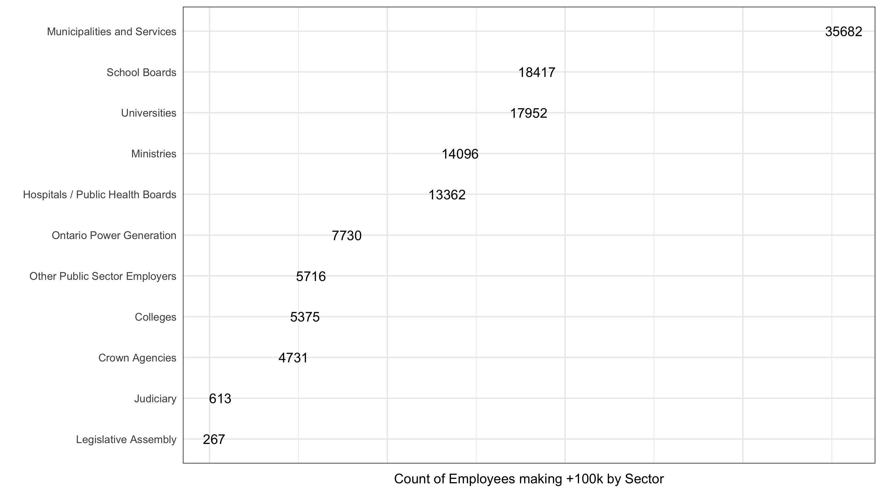
How many employees making $100k+ in each sector?
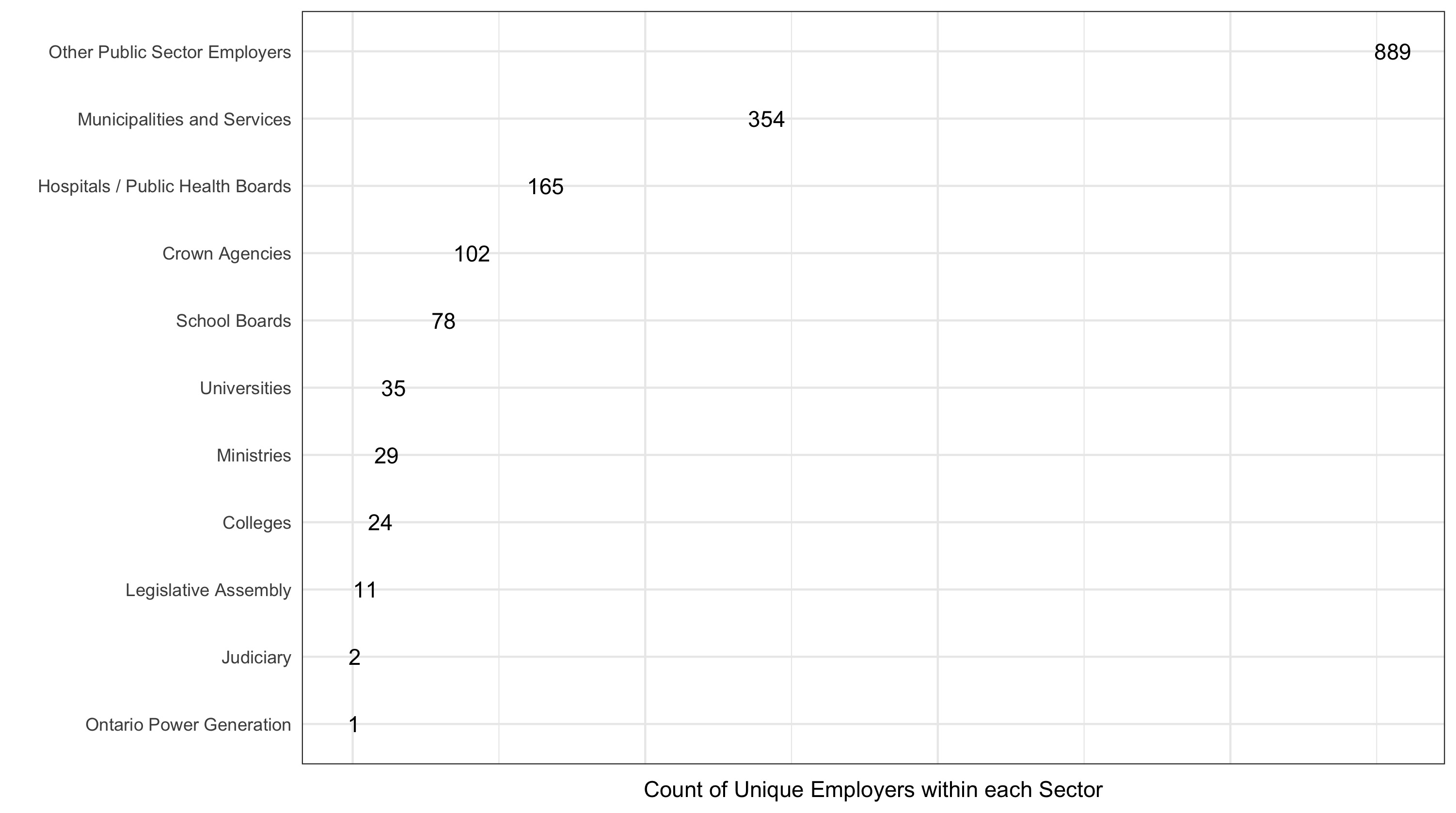
How many unique employers per sector?
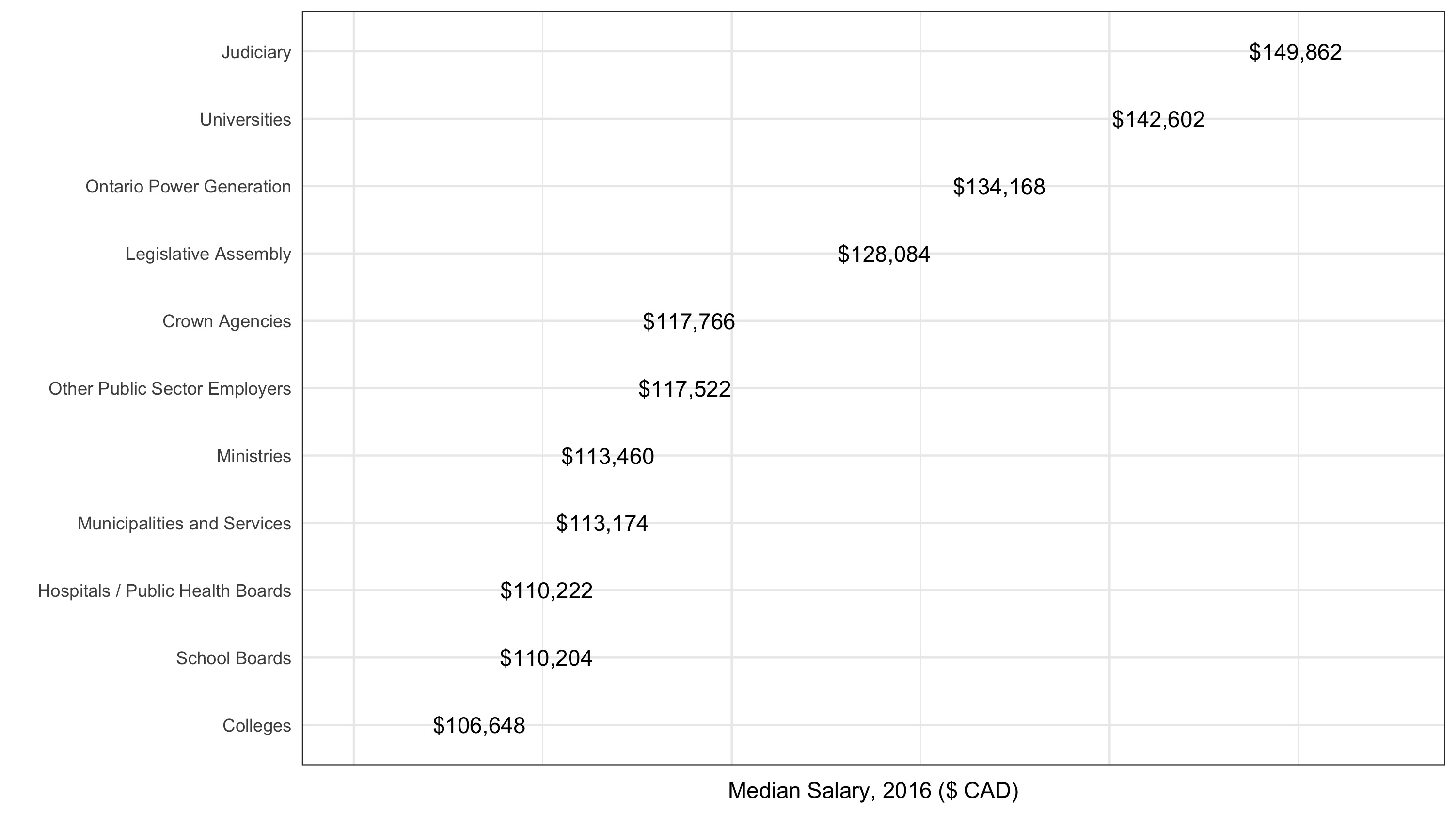
What is the median salary per sector?
I’m interested in universities in particular. What is the median salary at each Ontario university?
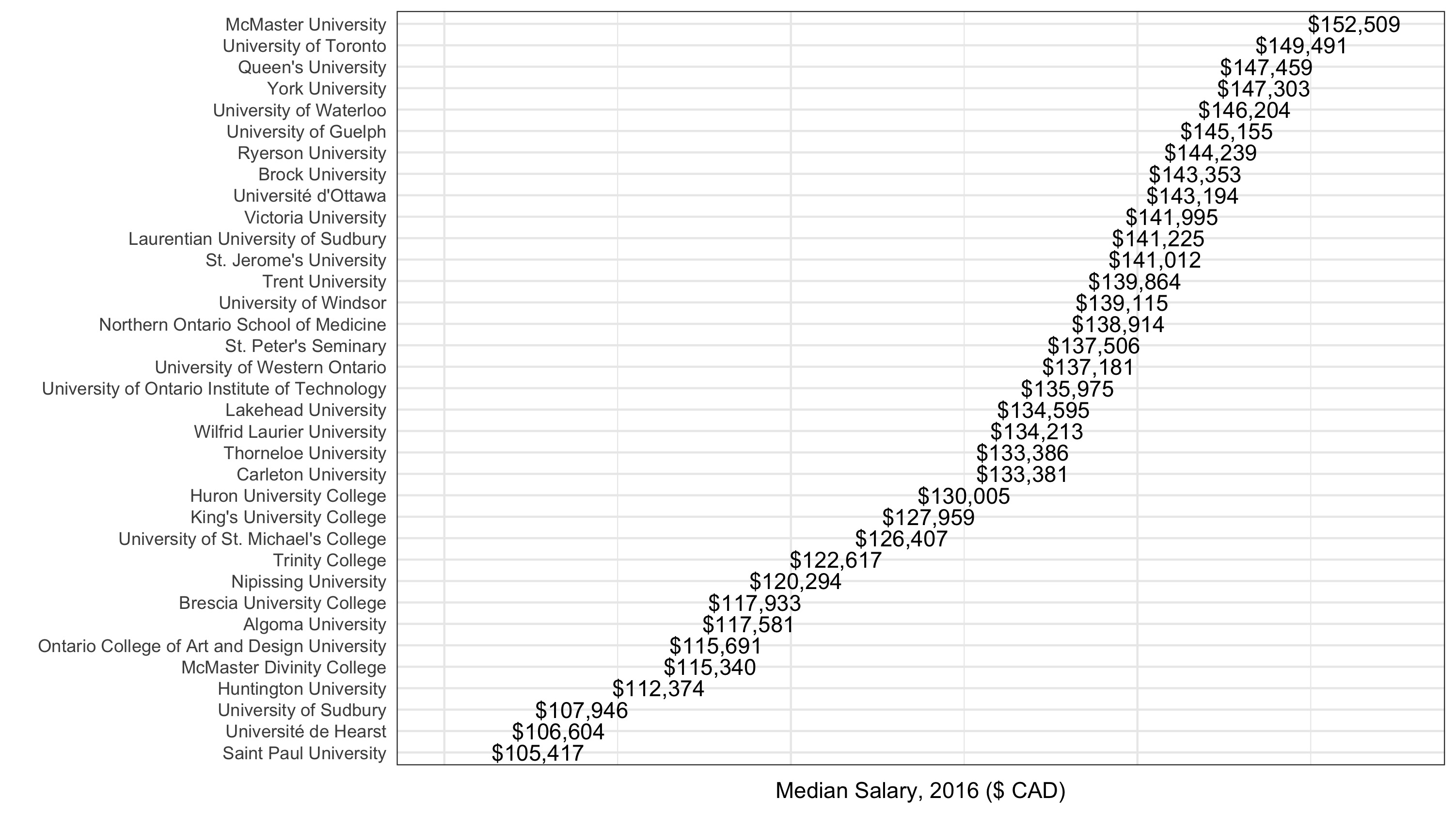
McMaster comes out on top. An interactive view of employees vs. total salaries by employer — the linear relationship is pretty clean, with a few large outliers worth exploring:
Top earners across the dataset:
And a breakdown by sector showing salary distribution at the top end: