I have spent a long time in school and accumulated lots of references as a result. I keep them all fairly organized in Zotero, which lets you export your library as a .csv file — so it wasn’t hard to read into R and do some basic analysis and visualization.
First things first, load the necessary packages:
library(foreign)
library(ggplot2)
library(ggthemes)
library(dplyr)
library(stringr)
library(tidyr)
library(tm)
library(wordcloud)
library(SnowballC)
Load the .csv exported from Zotero and focus on the columns of interest:
bib <- read.csv("bib.csv") %>%
  select(Item.Type, Publication.Title, Publication.Year, Author, Title, Publisher)
Let’s take a look at when things were published:
ggplot(data = bib, aes(x = Publication.Year)) +
  geom_bar() +
  labs(x = "", y = "") +
  ggtitle("Number of Articles or Books published per Year") +
  theme_tufte(base_family = "Fira Sans Light") +
  theme(strip.background = element_blank(),
        strip.text = element_blank(),
        axis.ticks = element_blank())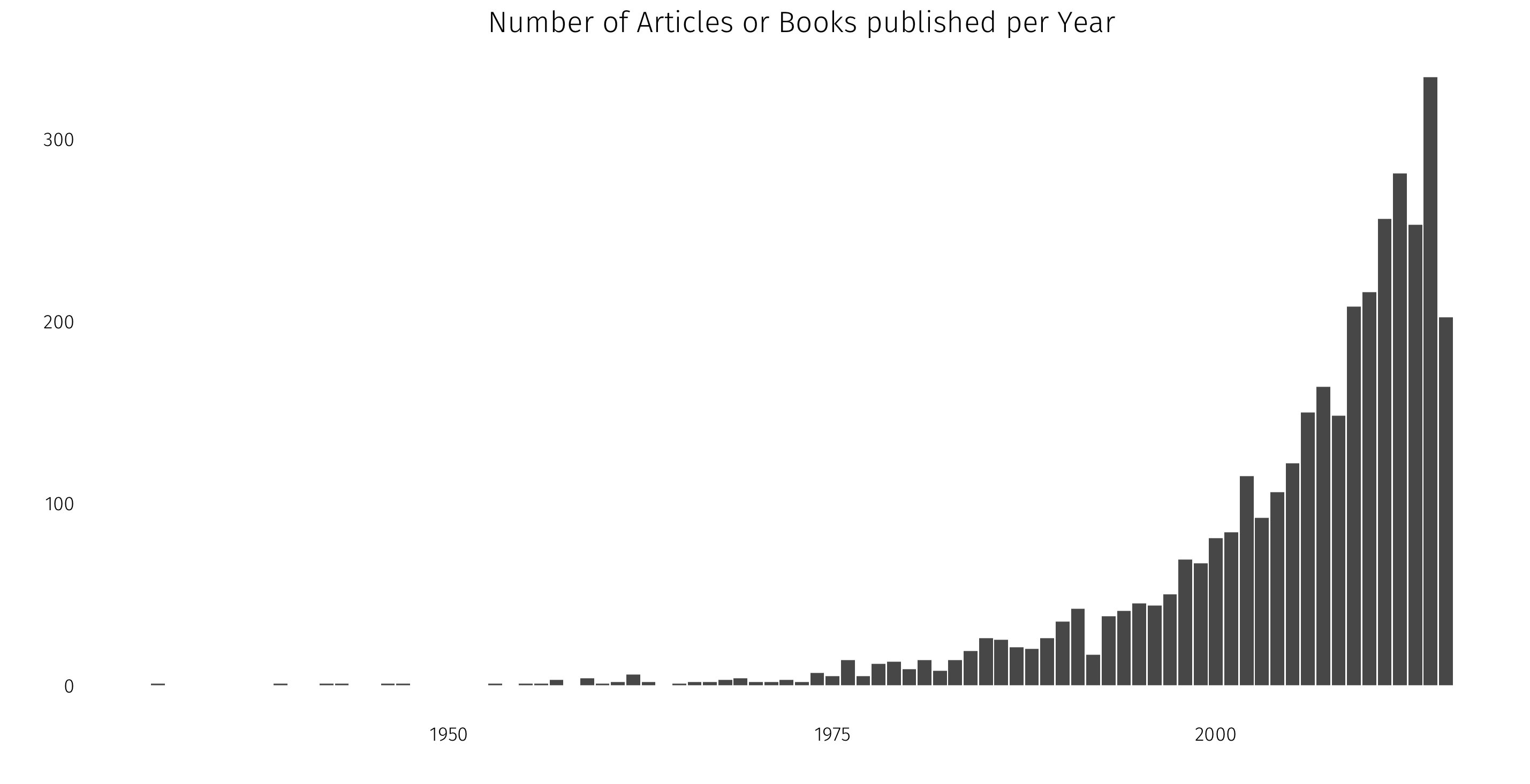
That distribution isn’t too surprising: I study political science, a pretty modern discipline, and so it makes sense that the bulk of my reference library would have been published within the last 35 years or so.
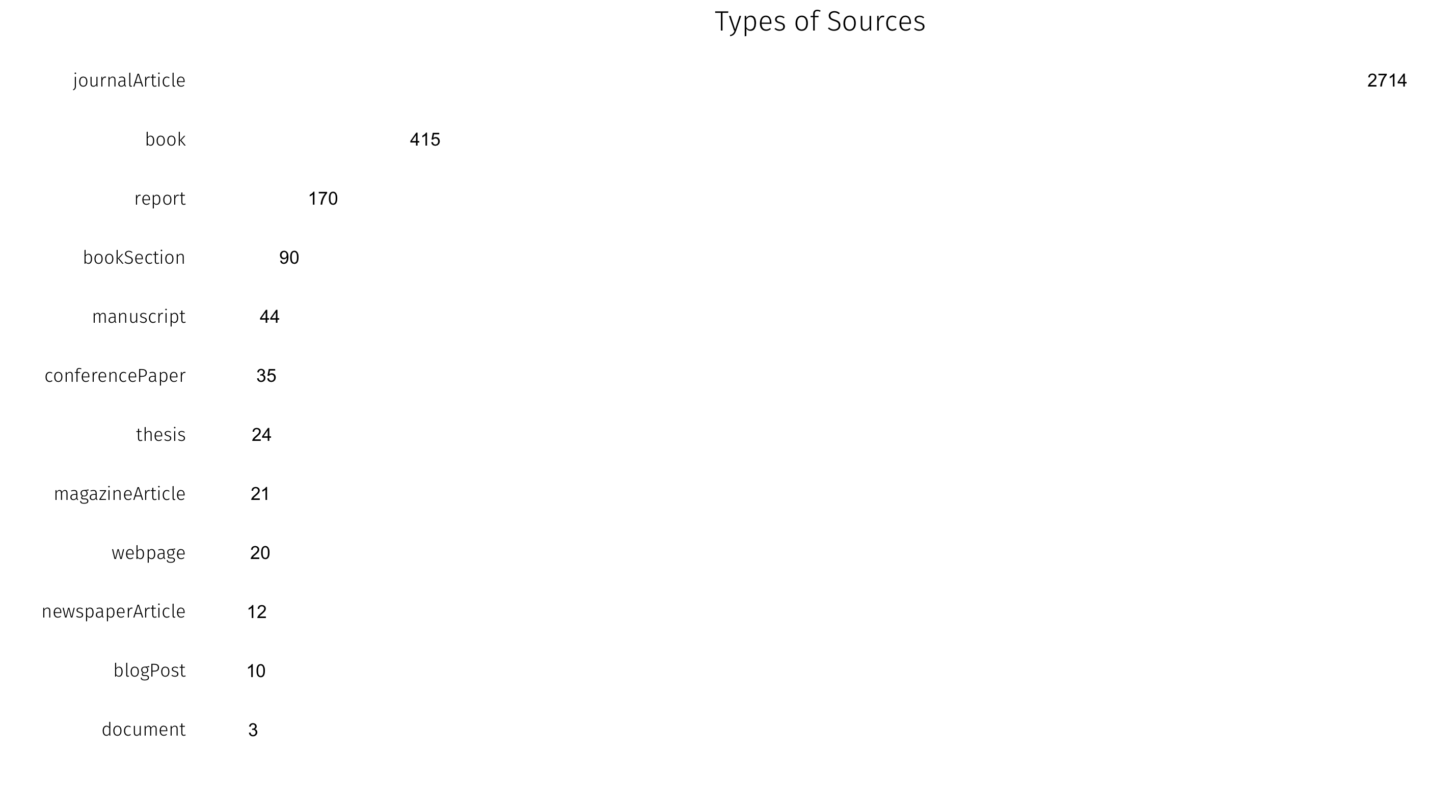
What is this library made up of? Zotero records the kind of document in the Item.Type column:
How about most-cited authors? I’ll plot all authors in the library with 12 or more citations. This requires a bit of data work, as the original file puts all authors in one column. First, separate coauthors into their own columns, then gather back into long format:
bib.a <- str_split_fixed(bib$Author, "; ", 10) %>% as.data.frame()

bib.a <- gather(bib.a, author.level, name, 1:10)

top.authors <- count(bib.a, V1) %>%
  filter(n > 11) %>%
  filter(V1 != "")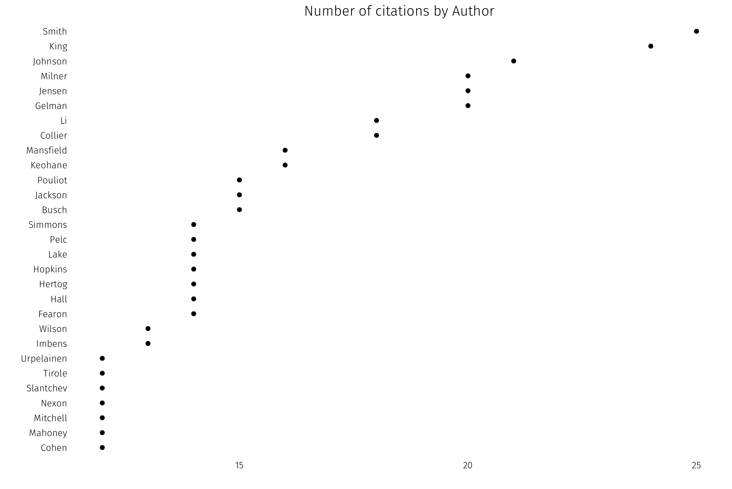
Lots of political economy, lots of international relations, some methodology.
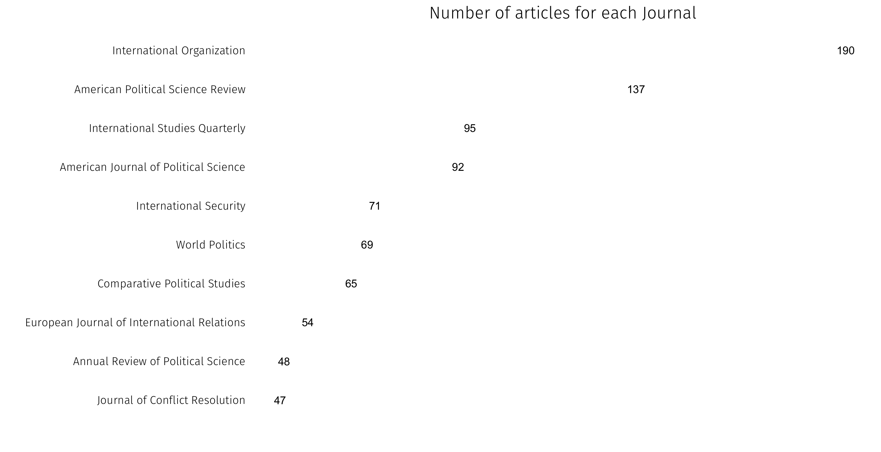
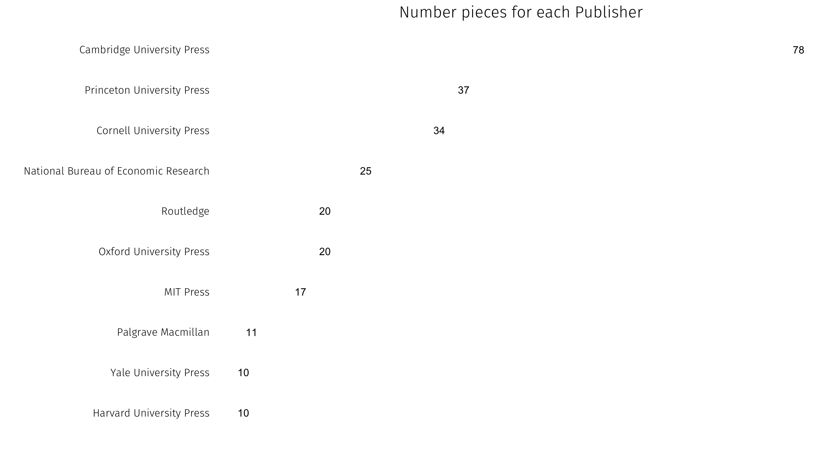
We can also look at popular publications — first by journal for articles, then by press for books:
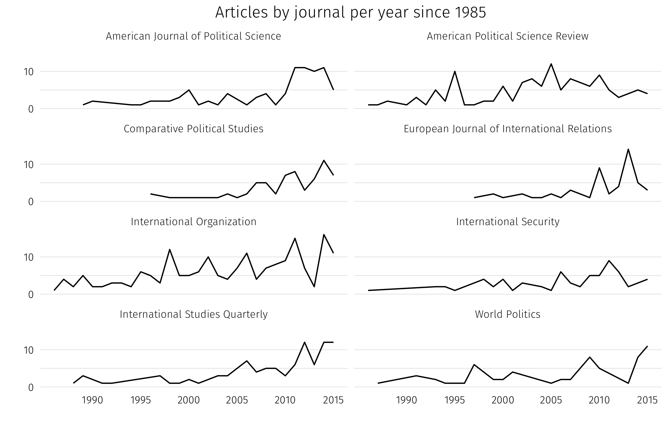
How journal counts vary over time for the most popular journals in the library:
Finally, a word cloud of the most common words in titles:
pubcorpus <- Corpus(VectorSource(bib$Title)) %>%
  tm_map(content_transformer(tolower)) %>%
  tm_map(removePunctuation) %>%
  tm_map(PlainTextDocument) %>%
  tm_map(removeWords, stopwords('english'))

wordcloud(pubcorpus, max.words = 200, random.order = FALSE)